
Text contrast is the most common accessibility issue. This video shows you how to demonstrate sunlight readability problems to clients who push back on higher contrast requirements.
I’ll give you a quick code snippet that creates a side-by-side comparison showing how any website looks in ideal lighting versus bright sunlight—right on their desktop computer.
The demonstration explains why:
- 4.5:1 contrast (WCAG AA minimum) is barely legible in sunlight.
- 7:1 contrast (WCAG AAA) significantly improves readability.
- 15-16:1 contrast for body text ensures comfortable reading in real-world conditions.
Watch as I demonstrate the tool on a live website, adjust contrast ratios in real-time, and show the dramatic difference sunlight makes for readability.
This simple snippet helps you win the contrast conversation with clients by showing them real-world impact.
CSS code snippet
To use this snippet, copy it and then go to the webpage in question. Open the inspector and right click on the <body> tag. Just after the <body> tag paste this code. Then click outside the <body> tag (ie: on the <html> tag) to commit the change. You’ll see the bright sunlight version on the left and the more typical desktop on the right.
<style>
body:before {
    position: absolute;
    background-image: linear-gradient(-41deg, #fff, hsla(0, 0%, 100%, .3) 15%, hsla(0, 0%, 100%, .4) 25%, hsla(0, 0%, 100%, .6) 52%, hsla(0, 0%, 100%, .4) 74%, hsla(0, 0%, 100%, .5) 88%, hsla(0, 0%, 100%, .7));
    content: "";
    width: 50%;
    height: 100%;
    z-index: 9999999;
}
body {
	filter: brightness(1.2);
}
</style>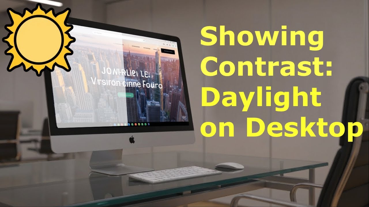
Transcript
The most common issue for web accessibility by far is text contrast. This means, does the text have enough contrast for people to actually read it?
Oftentimes, there will be pushback on using higher color contrast. One of the ways to get around that is to actually show people how this affects real people in the real world. One of the most common examples is bright sunlight. But one of the challenges is, how do I show that to a client on their desktop computer?
In this video, I will give you a really quick snippet that you can toss into any website and show your clients side by side how this website looks in ideal lighting and in bright sunlight. This will hopefully help get across to your clients that more contrast is absolutely needed.
On the Who Can Use site, they have a simulation for direct sunlight. That’s really helpful, but it’s also really tiny. We need to be able to show clients on their actual websites.
What I did was I replicated the snippet into something easy to use on any website. Here we are on one of my most popular pages, Font Examples, where I show you different examples of different fonts with a lot of important text.
I’m going to right-click and go to the Inspector. Now that I have the Inspector open, I’m going to click on the Body Tag. I will then right-click on the Body Tag and select Edit as HTML.
Just after the Body Tag closes, I am going to paste in my snippet. Then I will click on the HTML tag or anywhere else to apply that snippet. Now I can close my Inspector.
You’ll notice that on the left half of the page, we have a very washed-out look, and on the right half of the page, we have the relatively normal look. You can see the difference between the bright sunlight and more normal. It is a pretty significant difference.
But if you’ve actually taken your smartphone outside and tried to use it, you will notice that a lot of websites are very difficult to use in the bright sunlight. Here on this page, we have good, strong color contrast, but I’m going to show you what happens with lower color contrast.
When you’re using a chromium-based browser, you can select this little square next to the font color, and that will open the color picker. In this color picker, it’s going to tell you the current contrast ratio.
I can use this color picker to drop my contrast ratio down to right about 4.5. You’ll notice that just below 4.5, it’s readable in the desktop version, but in this washed-out sunlight version, it’s really, really hard to read.
If I start to lower that contrast ratio even more to about three, the website version for the desktop desktop, it’s getting a bit more difficult to read. Over here on the sunlight side, it is completely illegible.
This is why for normal desktop color contrast, the minimum ratio is 4.5. You’ll see that this makes it semi-legible on a smartphone, but difficult to read, and why the AAA recommendation of 7 is for most of the body content on websites. You’ll see that this is definitely easier easier to read in situations like bright sunlight.
Of course, for body text, I really try and get up to a higher contrast ratio, something around 15, 16, and that really makes it a lot easier for people to read in bright sunlight, which is a common situation that happens to people on a regular daily basis.
I hope this video helps to explain the effects of bright sunlight and how you can show them to clients on a typical desktop computer.
You can grab the code snippet blog post linked in the description below the video. Thanks so much for watching, and make sure to like and subscribe so that you can find out about future videos.